
Redesigning the JIOAI Website
I was working as a full time employee when i got a chance to design the Interaction & UX of the website, ensuring a seamless journey for the users.
Website
Technology
AI
Overview
JioAI, an innovative AI MLOps platform, advances business procedures with its top-notch Generative AI proficiency.

Approach & Design
Effortless, intuitive & readily assimilable web interface for tech-smart Jio AI

Connect with the senior manager to discuss the JIO AI website. Understand the requirements and ask essential questions necessary for moving forward.
Challenges
In 2023, I received a project to redesign the user experience of Jio AI. The major challenge was to replace the entire old website with a new one that offers improved usability.
Due to changes in the business model, the website needed to be redesigned to meet the new requirements. The flow and content were unclear for users, leading to difficulties in understanding the product.
What I did
To ensure the smooth collaboration, I began by understanding the requirements & drafting a PRD. Does some Understanding of user needs, goals & current challenges.
This approach helped in designing a more tailored and effective solution to meet user needs. Designed a user-friendly interface specially focused on maximum adoption and usability.
We have created objective, business goal, Process, timeline, kept in mind her heuristic evaluation to come out with better outcome.
I have a timeline of 4 days to handover the Project
My Role
In this project, my role as the UX designer was instrumental in shaping the entire user experience journey. From conceptualization to implementation, I played a central role in crafting solutions that addressed the core challenges and exceeded project objectives.
What to keep in Mind
Some Points are important consider before starting the process. As the project timeless
Understand the old website , follow the ux law and new thought to the website as it getting collaborate with Boltic
Have a limited time
Have to add things which useful and direct approach
As the platform is more of tech savvy, So it need to be a professional website
Process
My project process is little different for redesigning the website.
Understanding the Business Goal
Target User and User needs
Ideation and Moodboard
Design & Deliver
Understanding the Goal
When creating the website, questions arise about the type of website needed and what content should be included to make the product more user-centric."
Basic Research
Before the introduction of the Jio AI website, I understand that the website is for delivery the information of related to generative AI in your business workflows and build the next generation of software using LLMs.
Create Basic timeline to do basic research, find target users, create moodbood for the theme and ends with creating the high fiedity as need to create only one page for the website.
Searching related things
As Doing Basic Research i got some website which are in not in much similar business model, Some website i checked are the Azure ML, Domino, ModelBit, vertex AI.
The main thing for us is to give better understanding of the product and the theme part. According to that i further move with the research.


Old Design
"As the business model has changed slightly, the old version of the website serves as inspiration
Target User & User Needs
Who our target users, what they want from us? who are them? some question always in my mind to understand behaviour and need of the user
Target User Understanding
As by understanding and communication to our shareholder and upper management that target users are basically the B2B business which work under data operations, integration, analytics, & governance.
Here’ various sectors, particularly those heavily reliant on data-driven decision-making.
Finance
Healthcare
Retail
Consulting Firms
Manufacturing
Telecommunications
Data-driven Startups
Needs understanding
As we know our target user from different Modes. Also need to focus on what will be the actually user needs.
What we are providing to them in our platform?
How can we solve certain problem ?
Do we have cases user this too ? By which help our business .
Do we have certain core features ?
How user connect with the teams ?
Ideation and moodboard
Finally we understand our users, by that easy to focus on solution
Insights
By doing secondary research and target user i understand and come to final phase of insight.
It is important to keep relevant information that highlights small features with big impacts.
Having too much can be as detrimental as having nothing at all. Therefore, there is a need to categorize things effectively.
Implement a straightforward navigation structure that allows users to easily find the information they need.
Optimize the website for fast loading times to minimize user frustration and abandonment.
Consider adding a solution section with specific graphics to create a more impactful content website.
Dedicate the last section to connecting users with the main SaaS product signup.
Mood board
The primary aim of our moodboard was to establish a cohesive visual language for our UI design. By curating a collection of images, colors, textures, and other visual elements, we sought to define the mood, tone, and personality of our interface


Design & Deliver
After gaining a through understanding of your users and formulating a plan, the next step is to brainstorm ideas for how they will interact with your interface.
On Day 2, begin creating the layout of the website and coordinate with the graphic and content teams. This ensures that they can commence their respective tasks in parallel with website development
Basic Design System
The key here is to think about the user experience first and foremost. How will they interact with your interface? What kind of information do they need to be able to find easily? By answering these questions, can start to form a clear picture of what your interface should look like.
After finalizing the design aesthetics, I developed a versatile Design System to maintain consistency throughout the product.
This system established fundamental elements such as colors, fonts, icons, and styles, ensuring a cohesive look and feel from the outset. With the website's flow already understood, we proceeded directly to crafting high-fidelity elements.
Color
Create Two set of colour for both light and dark version. Use Variables to come idea into existences.
By implementing light and dark mode options in the interface design, the project aims to prfioritize user preferences and improve accessibility, ultimately enhancing the overall user experience.
Using of figma variables create two set of colours.


High Fidelity Design
Crafted for Comfort and Innovation
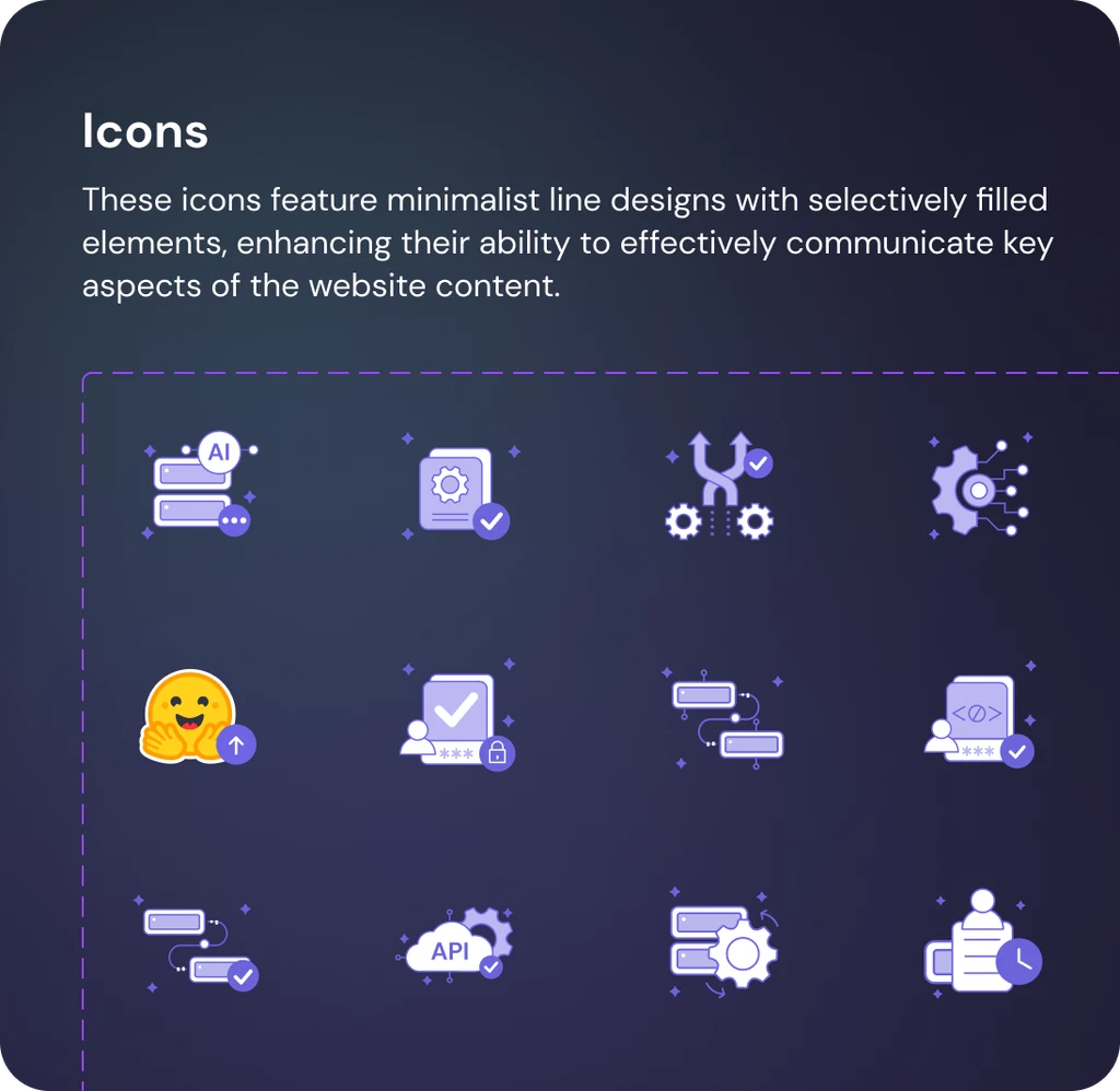
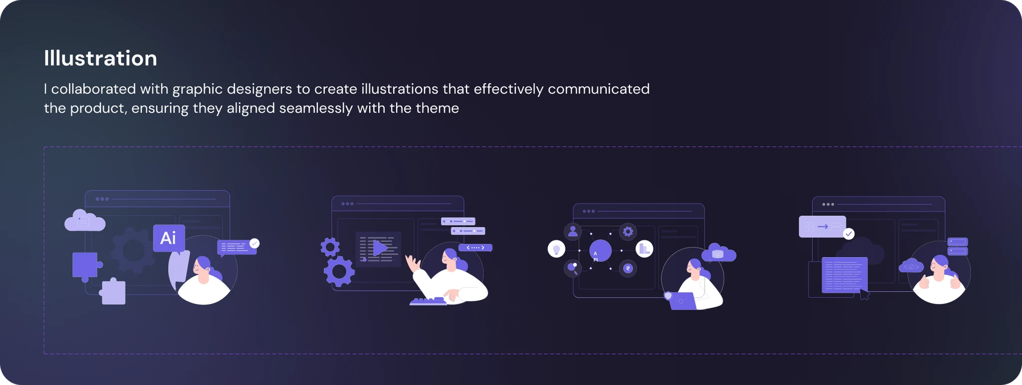
While focusing on the theme, I explored various options and ultimately settled on a clean and informative design. I divided the content into 7 sections, incorporating relevant icons and illustrations to enhance understanding and engagement
Clean, Bold, and Captivating
"I used a simple yet bold design approach to make the website easy to use and adaptable. Bright colors were carefully chosen to catch users' attention, and small animations and interactive features were added to keep them interested and involved in the content.


Hero Section

Dark Mode
Light Mode

Platforms

Core Feature


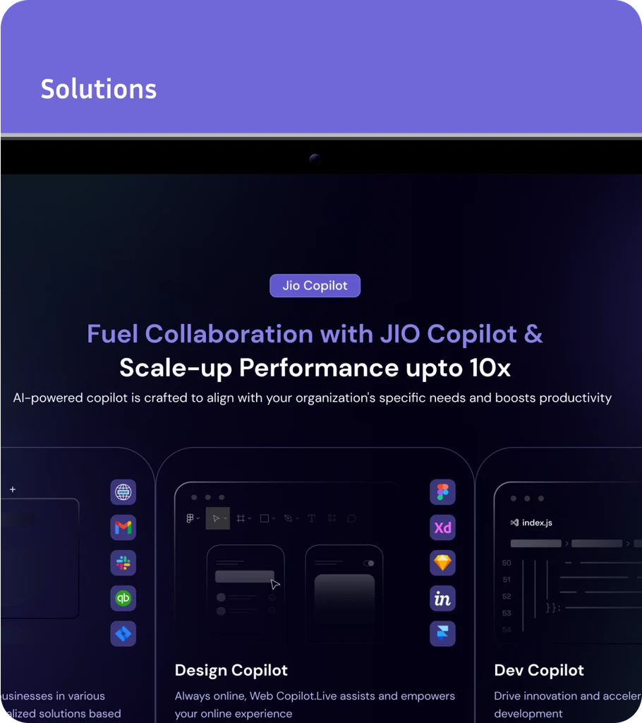
Solutions


Footer

Final Delivery
Before delivering the final design, it is first shared with senior managers to verify its accuracy. Any missed elements are addressed before the final delivery to developers. Additionally, it offers insights into potential improvements that can be made through code.
In this project, development is conducted in Webflow, where design can be easily copied and pasted without the need for manual coding. This approach aligns with the company's preference for faster development and more intuitive design. However, conducting a UX audit at the end remains crucial for ensuring optimal user experience
Hi, I’m Sahil Sethiya. A Self made designer who loves to create creative designs, i hope you will like it. Follow me for more.